

My contributions: User research, user interviews, usability testing, UI design, prototyping
CAPSTONE PROJECT
inHouse App
ABOUT
A student’s search for off-campus housing can be both exciting and daunting. This pursuit is further complicated by the fact that individuals across Canada are witnessing an increase in rental scams, driven by a surge in rent prices and heightened competition.
To further refine my scope, I conducted user interviews and gained insight into how participants face an unreliable rental process due to frequent listings with insufficient or incomplete information.
inHouse, an iOS application, offers a dedicated platform for students to find suitable housing in Toronto. Students can employ distinctive filters to enhance their search and peruse reviews from past tenants all within one app —all in-house.
BACKGROUND
THE DESIGN
An app designed for students to streamline their search for suitable housing and build confidence in listing accuracy through reviews from previous tenants.


THE PROCESS
Persona & Experience Map
Task Flow
This flow allows students to eliminate irrelevant housing options based on criteria, livability, and a community review system.
Sketches
With a finalized primary task flow and Sam’s pain points and motivations in mind, I began sketching various iterations to visualize the appearance of different screens and evaluated the pros and cons of each design.
FINAL SKETCHES
Mid-fidelity Wireframe
Brand Development
I performed two rounds of usability testing, each consisting of five individual user test sessions. The purpose of these testing sessions were to observe real users interacting with inHouse and gather immediate insight on any usability issues. To uphold consistency across all user testing sessions, I created a scenario summary and test script consisting of open-ended questions.

Design Systems
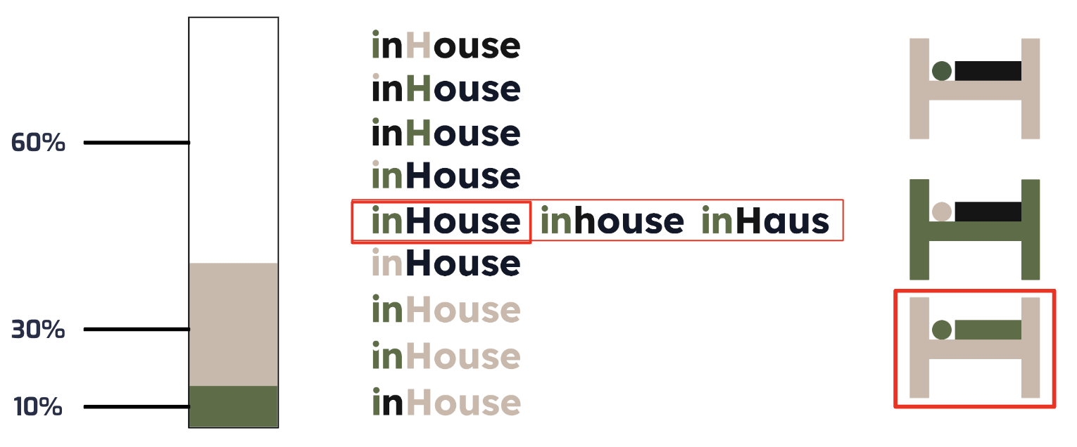
To develop a primary brand colour, I extracted colours from my mood board. I chose the beige colour and then compared this beige against the remaining colours to find a secondary colour.
High-fidelity Wireframe
Colours Extracted From Mood Board

Secondary Colour Exploration


Using the atomic design system, I organized all of the elements that bring inHouse to life. Developing a design system also upholds consistency in future app developments across various roles.
Through the development of a persona and experience map, I was able to visualize Sam’s actions, thoughts, and feelings experienced at each stage of his journey. Sam encounters the most challenges in the narrow and decision stages. This visualization helped focus efforts on developing a digital solution tailored to address these specific touchpoints.
WHAT I LEARNED
Good questions are important to ensure you get meaningful results from user testing.
Keeping a design system and starting it early is key to a productive and efficient design process.
NEXT STEP
Refine the animations and functionalities in my high-fidelity prototype.
To make my app more robust, I want to add user flows such as identity verification upon sign-up and viewing a user’s profile to see all listings under an account.