
HEURISTIC EVALUATION
Cineplex App
My contributions: User research, UI design
Team Size: 4
ABOUT
Cineplex is a leading Canadian company operating within the film entertainment industry. It offers online platforms and a mobile app for users to purchase ticket, browse showtimes, and access other movie-related information.
BACKGROUND
Usability heuristics are general principles for designing user-friendly interfaces. In Fall 2023, Cineplex launched a UI redesign as part of a system update, which received overwhelmingly negative feedback from iOS users. This made the Cineplex app a strong candidate for a heuristic evaluation to identify and address key usability issues.

Reviews of the new update revealed users struggled to complete critical tasks such as navigating through movie and theatre selection. To understand the root of these frustrations, we narrowed the scope of our evaluation to focus on a core task - buying a movie ticket.
All screens in the task flow were redesigned except the ticketing screens. When users arrive at the ticketing screens, they encounter numerous visual inconsistencies.
These visual inconsistencies include:
1. Shape and position of the input fields
2. Color and typography
3. Margin alignment
4. Padding
IN-APP TASK FLOW OF BUYING A MOVIE TICKET
EVALUATION AND REDESIGN

PROBLEM

USABILITY DECISION #4 - DESIGN REFERENCES
In anticipation of questions about my redesign reference, I took the initiative to redesign all of the ticketing screens in the style of the new update as proof of concept to present alongside our evaluation.
Before I redesigned usability decision #4, I suggested to my team that I reference the style of the new update rather than the existing ticketing screens. We all agreed that this would ensure a more cohesive and intuitive user experience throughout the entire task flow.


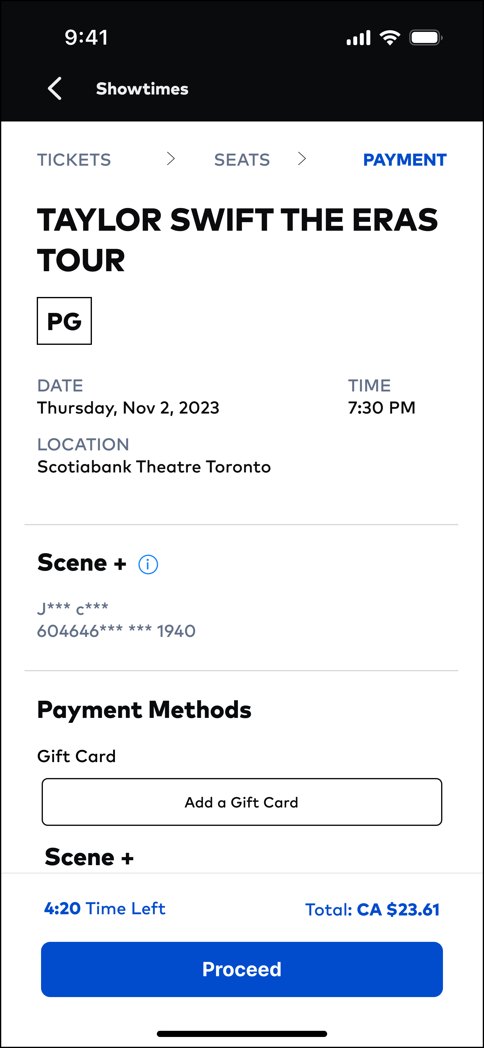

TICKETING SCREENS - BEFORE

TICKETING SCREENS - AFTER
THE PROCESS
Identifying design problems
Each team member evaluated the task flow independently to identify heuristic violations and rate their severity. Of the 10 principles, we identified four design decisions that each violated 1 of the 10 heuristics.
Overall Assessment
I followed a 0 to 4 rating scale to rate the severity of each heuristic violation based on a combination of 3 factors:
The frequency with which the problem occurs
The impact of the problem if it occurs
The persistence of the problem
Decision-making
I organized our usability recommendations into a priority matrix to identify which solutions would yield the highest impact while requiring low effort.
WHAT I LEARNED
Discerning the Heuristics. This project was my first introduction to the concept of heuristics for UI design. Learning about Jakob Neilson’s 10 general principles for interaction design provided me with a structured approach to identifying opportunities for improvement. It was also important for my team and I to remember that heuristics address UI issues, not UX issues.
Small Changes Make a Big Impact. I've learned that significant usability improvements can be achieved through subtle design adjustments, highlighting the crucial role of iterative refinement in the design process.
Prioritization Is Key. Using the usability priority matrix, my team and I were able to establish objective decision-making and address the most critical issues first. The process of justifying our prioritization also served as a reminder that the user always takes center stage and that usability heuristics should consistently align with their task flow.
NEXT STEPS
Usability Testing. Following the design changes informed by the heuristic evaluation, the next step involves conducting usability testing with real users to validate the design decisions. The goal of usability testing is to gather user feedback on their experiences and identify any additional usability issues that may not have been detected through the heuristic evaluation alone.