

REDESIGN
Knife Shapes
My contributions: User research, UI design, prototyping
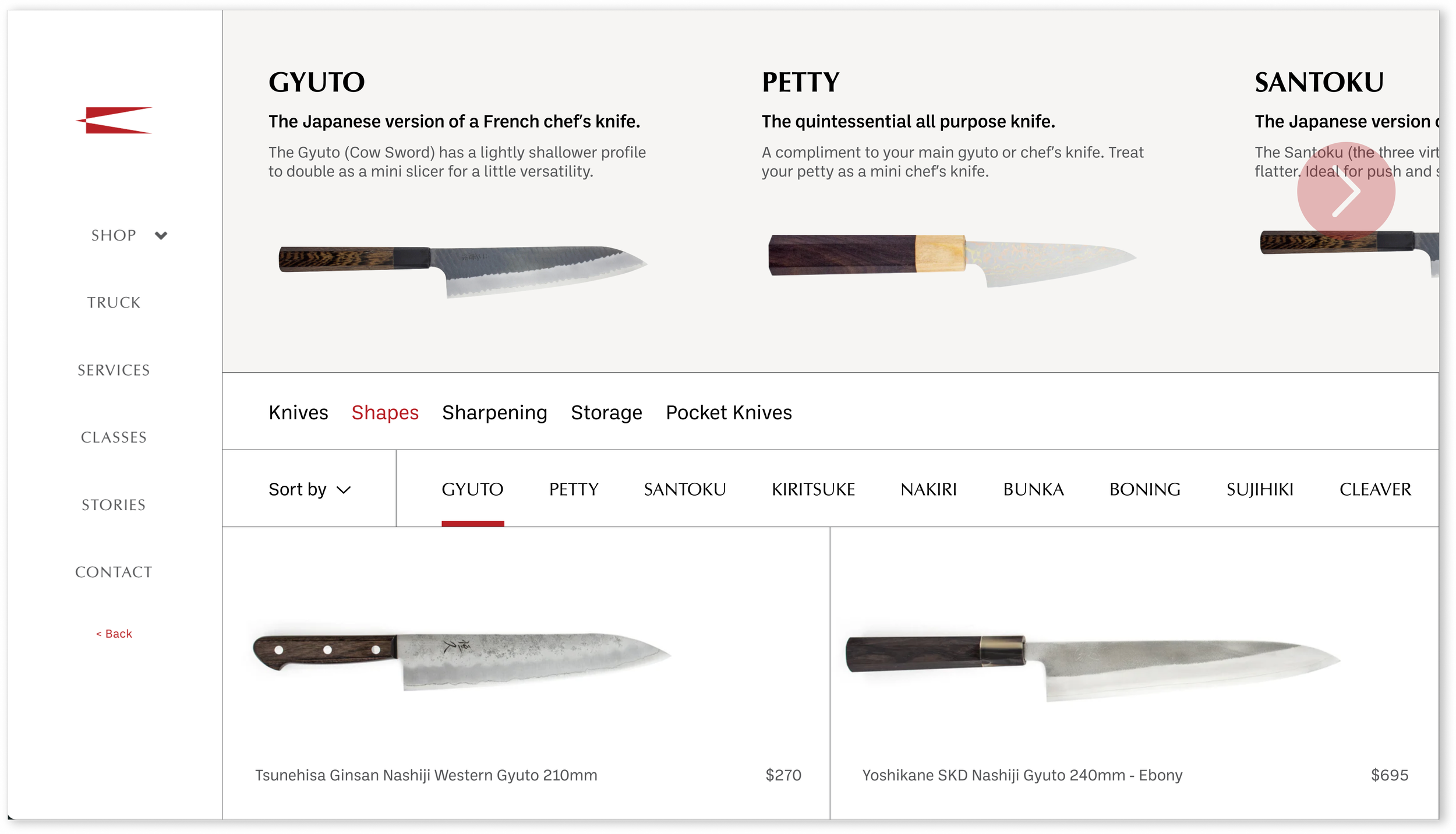
SHOP BY SHAPE
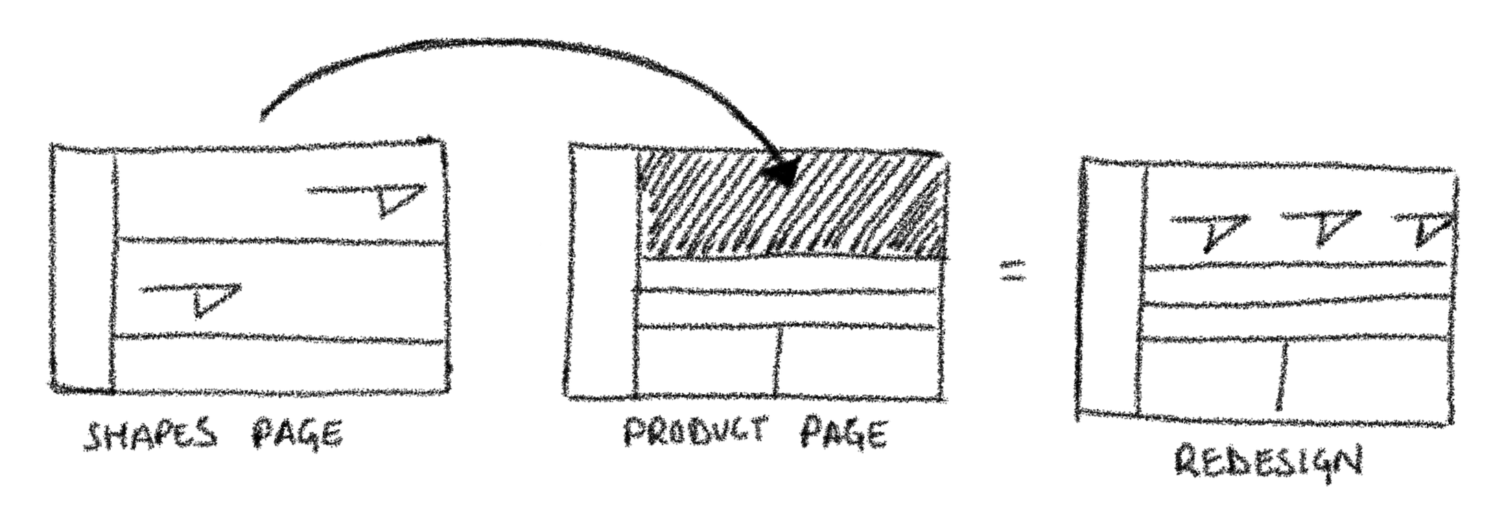
The Shapes page on KNIFE’s website is the only place where users can learn about and shop for specific knife shapes. When users click a shape, they’re taken to a Product page where navigation relies on the search bar.
The problem is that if a user doesn’t know a shape’s name, they’re forced to navigate back and forth between the Shapes and Product pages to view other knives.
Left to right: Shapes page, Product page
The redesign allows users to understand the breadth of the selection at a glance.
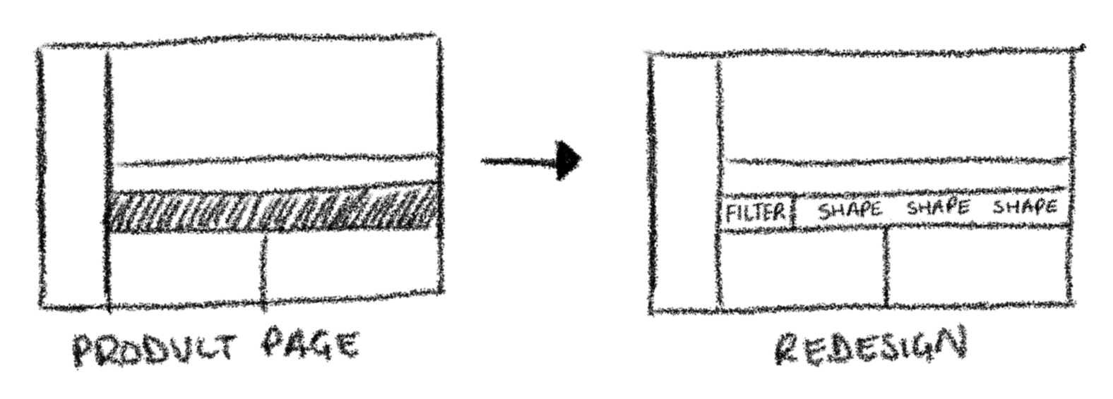
Product Navigation Bar
Keeps users oriented by sticking to the top when scrolling and provides access to all types of knives.
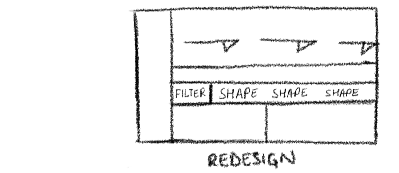
ANATOMY OF REDESIGN
ABOUT
KNIFE Toronto is a destination for the finest knives, cookware, and coffee accessories in Canada.

THE REDESIGN
Scroll Menu
Each section boasts individuality using hierarchy - allowing users to skim through and retain key differences.
PROTOTYPE
I saw this project as an opportunity to address gaps in how users find and compare knives. By leveraging the existing layout and content, I enhanced navigation across both pages.
THE PROCESS
At mid-fidelity wireframing stage, I prioritized making the shape descriptions more scannable by separating the content into a subheading and concise description. I referenced the original Shapes page for text capitalization and used varied text sizes and weights to create a clear visual hierarchy and define the active states of UI components.
I referenced KNIFE’s website for text capitalization, font choices, color palette, and assets such as the logo and product photos.
Throughout the sketching process, I focused on preserving the original page structure, as knives are uniquely suited to a horizontal layout. After several iterations, I pursued the layout that felt the most balanced and intuitive for existing users.
MID-FIDELITY WIREFRAME
WIREFRAMES
WHAT I LEARNED
Strive for pixel perfection but acknowledge that a design is never truly finished. I learned that spending too much time perfecting visual details early on can lead to significant delays. Prioritizing functionality and embracing an iterative process creates more opportunities for continuous refinement. Let the design see the light of day!
NEXT STEPS
Usability testing. This involves gathering feedback from real users to evaluate the design's ease of use. Key aspects such as the scroll menu and product navigation bar will be tested to ensure they effectively meet user needs and behave as users expect.
Mobile Optimization. Adapt the design for mobile devices to ensure a responsive and consistent experience for users across smaller screen sizes.