REDESIGN
Materials Guide
My contributions: User research, UI design, prototyping
ABOUT
Artworks3DP is a small business located in Toronto that provides expert 3D printing services.
The redesign supports future iterations, allowing for new filament finishes, colors, or use cases to be added seamlessly.
Product Cards
The product cards follow a uniform design structure which allows users to compare finishes and common use cases side by side. Users can also view all color swatches without losing their place. Information about filament properties - available for ABS and ASA only - alters the appearance of the product card but remains familiar.
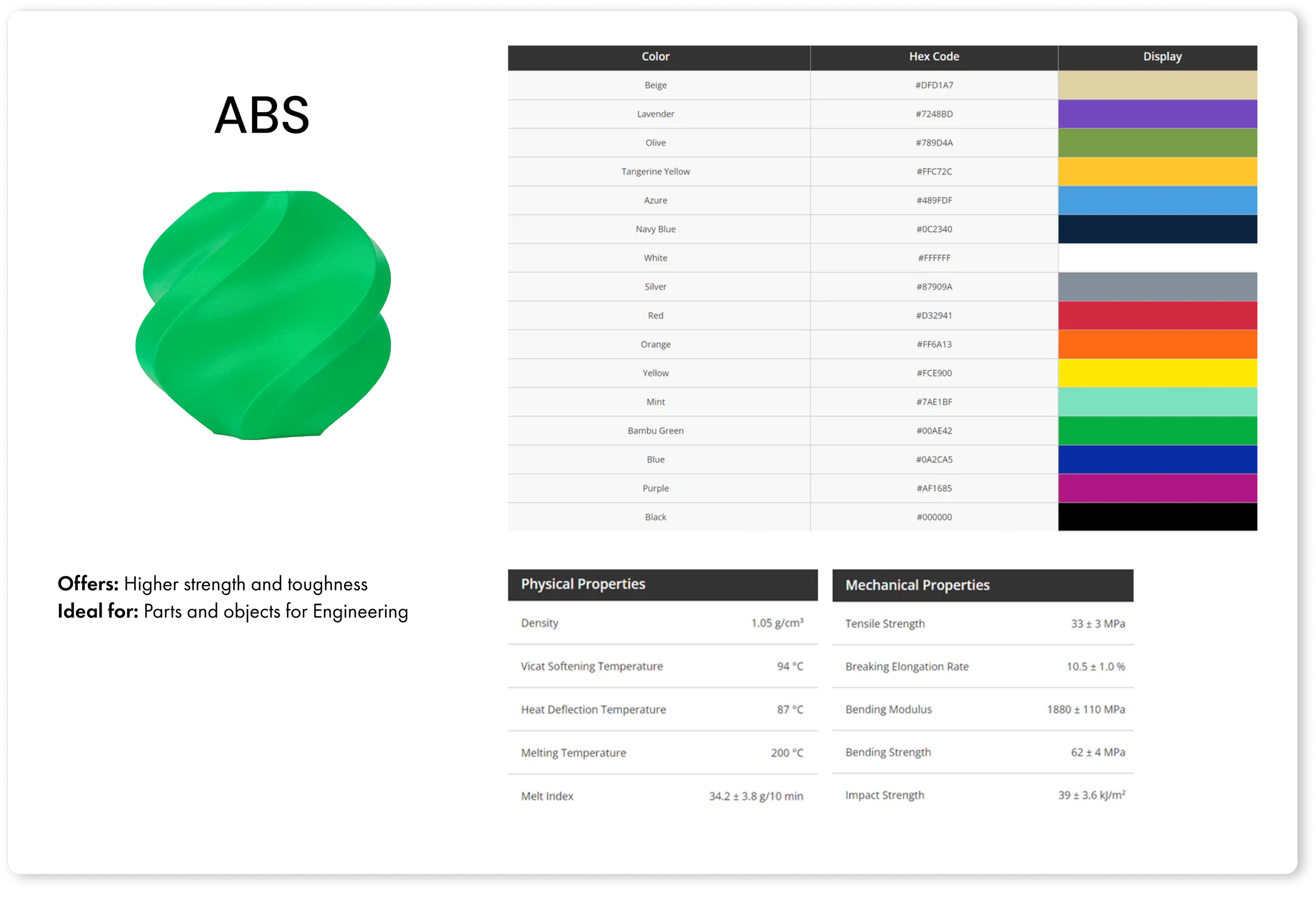
VARIANT 3: FILAMENT PROPERTIES
PROTOTYPE
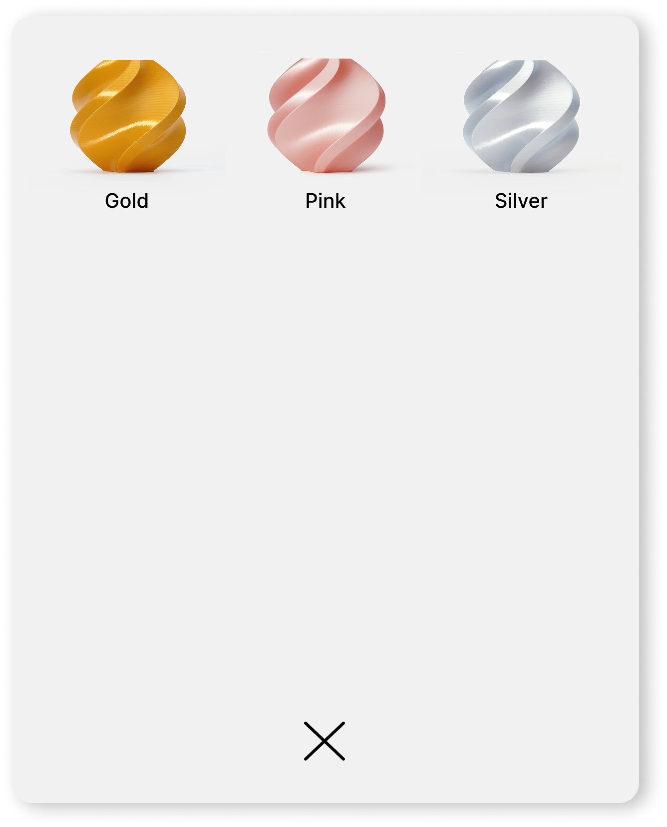
VARIANT 2: COLOR SWATCH
MATERIALS GUIDE
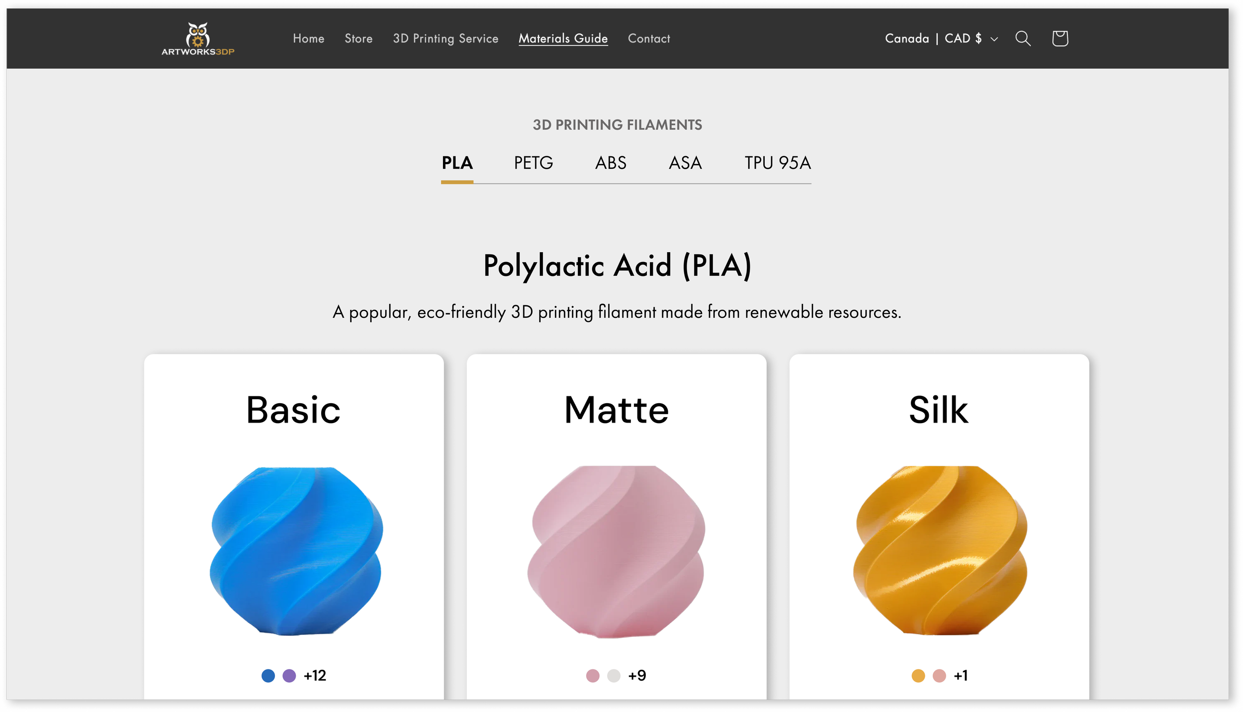
Artworks3DP offers a materials guide to help customers choose the right type of filament for their custom orders. With filaments varying in available colors and finishes, the challenge was designing an interface that could accommodate different levels of detail for each material.
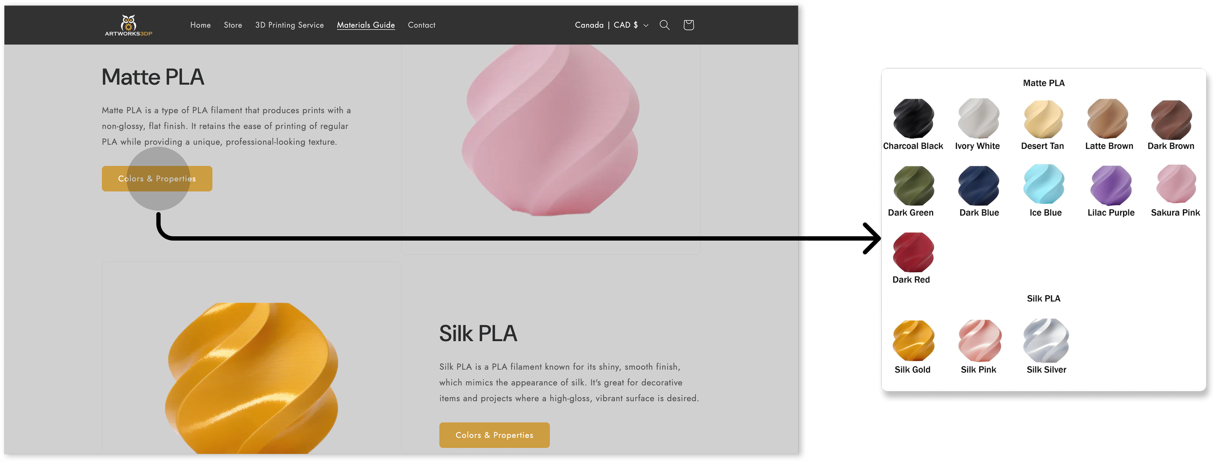
Left to right: Materials guide, Color menu
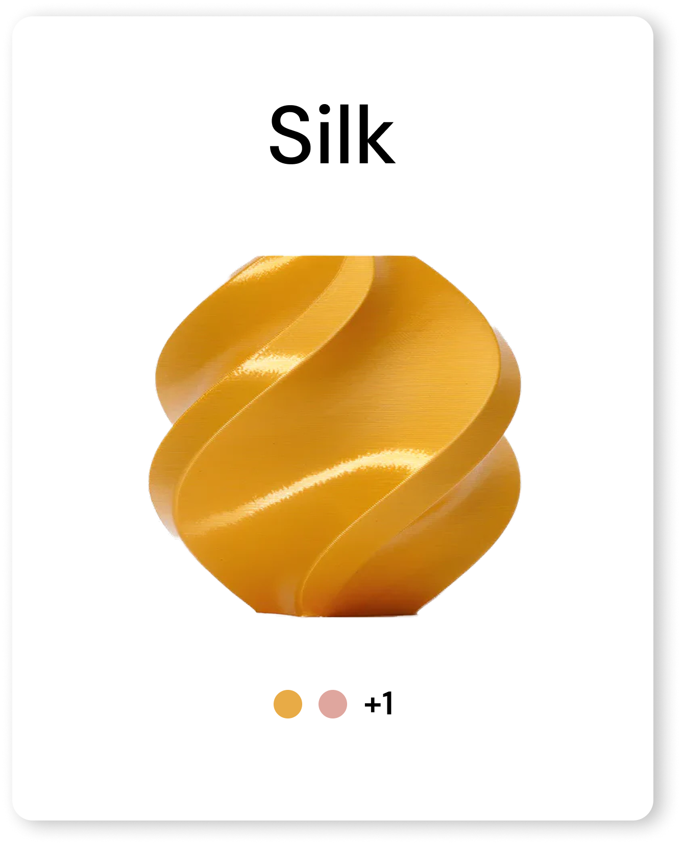

VARIANT 1: FILAMENT FINISH
With filament colors and properties split across separate pages, I saw an opportunity to improve categorization and refresh the materials guide by making information memorable and easy to digest.
THE REDESIGN
THE PROCESS
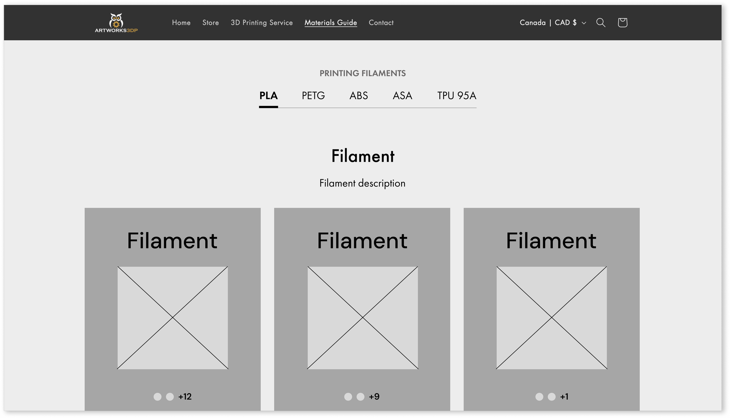
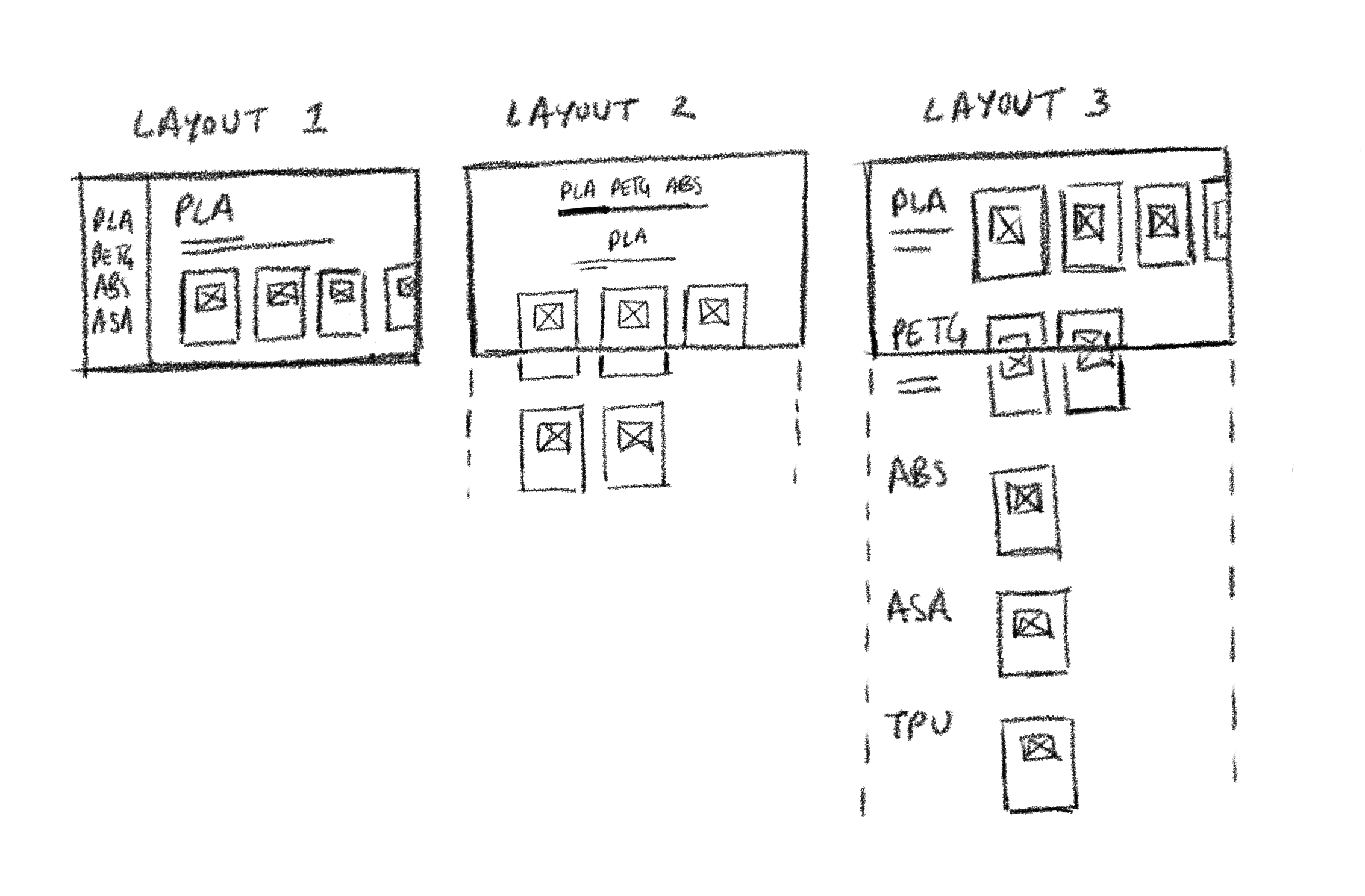
The original Materials guide presented all filaments and their finishes in a single, continuous list. While sketching layouts, I prioritized grouping finishes under their respective filaments to improve clarity and scanability. Information about materials is readily available, while exploring color options remains optional.
Layout
Knowing the redesign would follow a dark theme, I tested and finalized text colors during the mid-fidelity stage and prioritized accessibility by ensuring sufficient contrast between text and backgrounds to meet WCAG standards.
MID-FIDELITY WIREFRAME
Product Cards
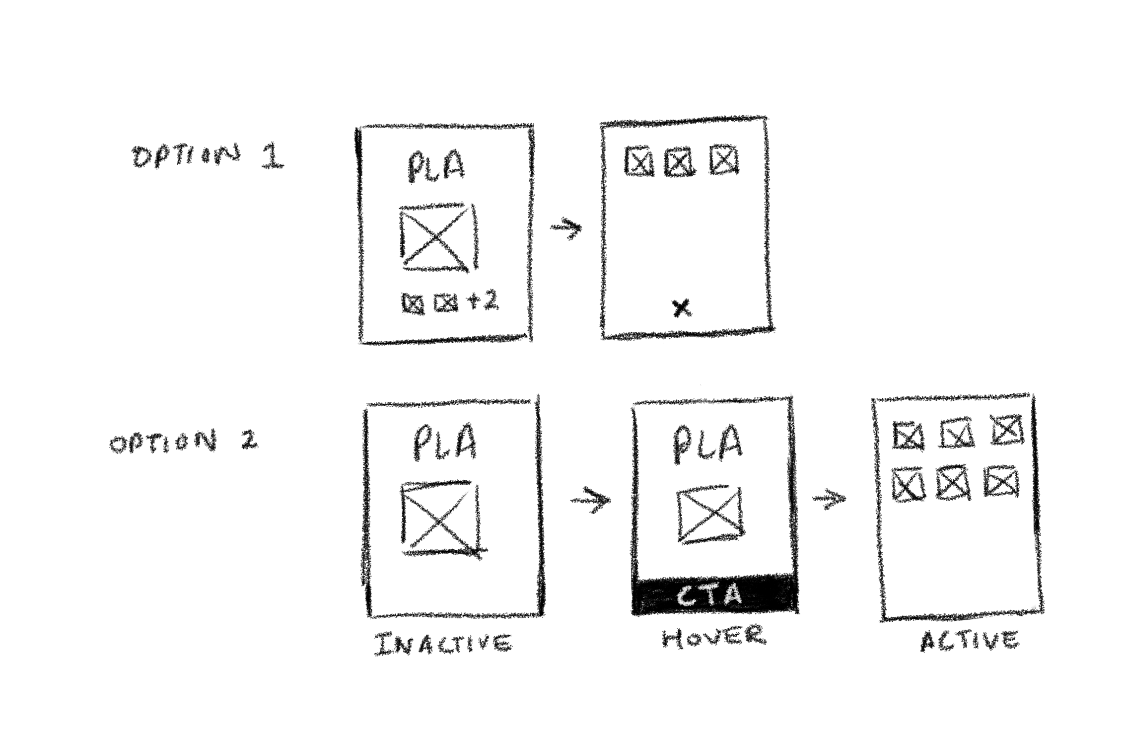
Option 1: Preview of color options on the product card with a CTA button.
Option 2: Product card presents a CTA button while hovering.
WHAT I LEARNED
Throughout this project, I learned the value of designing for users whose preferences differ from my own. By relying on research and real use cases, I was able to uncover needs I hadn’t previously considered. This shift in perspective helped me design with greater empathy and ultimately led to a more dynamic design solution.
NEXT STEPS
Optimize the design for mobile platforms and work with Artworks3DP to implement the redesign.
